
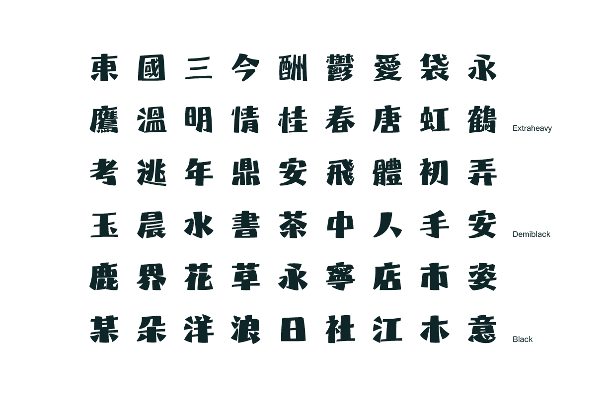
Gentle waves touches your toes while Dad explores the underwater world, as sea breezes whisper like children's voice about the endless bond and admiration for father.
"Ocean Dad" uses bold strokes to portray both admiration for fathers and yearning for the vast ocean. The strong contrast of horizontal and vertical strokes expresses the excitement of waves. Presenting the ocean's ever-changing moods with gentle and free-flowing dots and diagonal strokes that reflects scattered waves.
The combination of bold, firm stroke and gentle curves reflects both a father's strong presence while showing his tenderness for children.
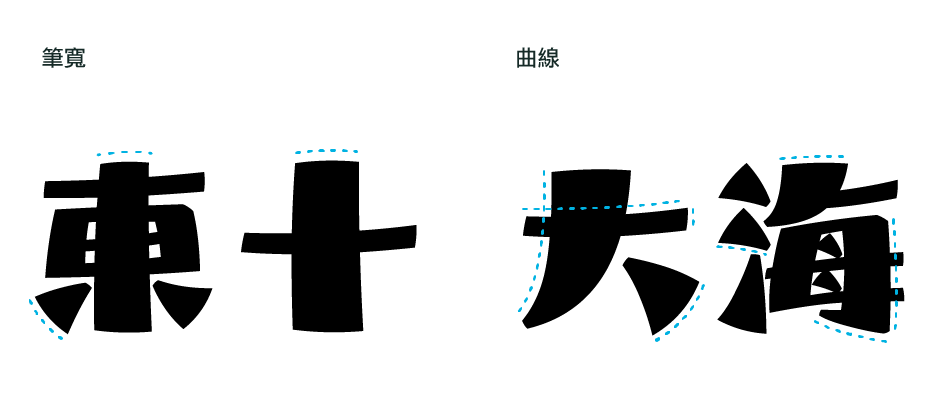
Bold stroke widths represent the ocean's steadiness, while dramatic thickness contrasts reflect the waves, presenting the diversity of the marine world.
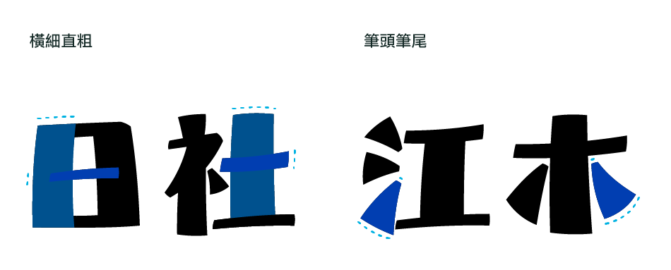
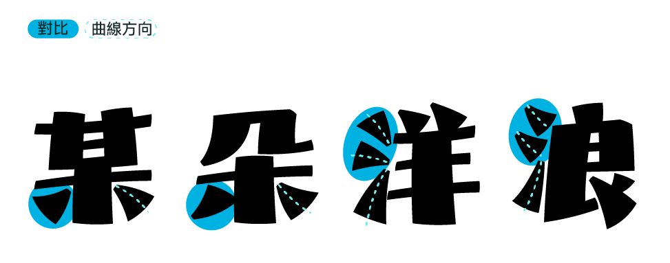
Strong contrasts and diverse curve directions create playful waves between characters, gracefully calming back into the ocean of characters after a joyful rise.
Square enclosures '口' designed with narrow tops and wide bottoms create the imagery of boat sails.

Thin-top and thick-bottom design captures the perspective of looking up at the mast from the deck.


The angled cuts at upper right corners and hook corners bring softness to the typeface, reflecting the boat tenderly embraced by the ocean.
Following the design concept of Chinese characters, it also maintains powerful curves and high-contrast tension, depicting ocean waves starting from designing the uppercase 'M'. This imagery then extends to the design of other Latin and European characters.
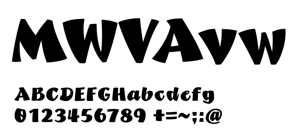
The overall width is bold and substantial, creating strong contrasts like ocean waves splashing and scattering. The strong, upright design of the mast is mirrored in Latin vertical strokes.
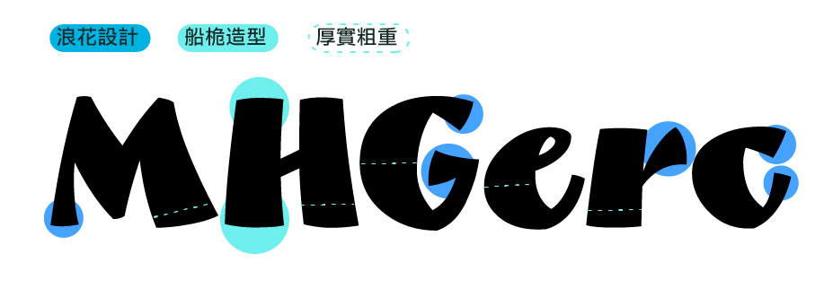
Various slant angles and curves reflect the movement of waves as they roll onto the shore.
