
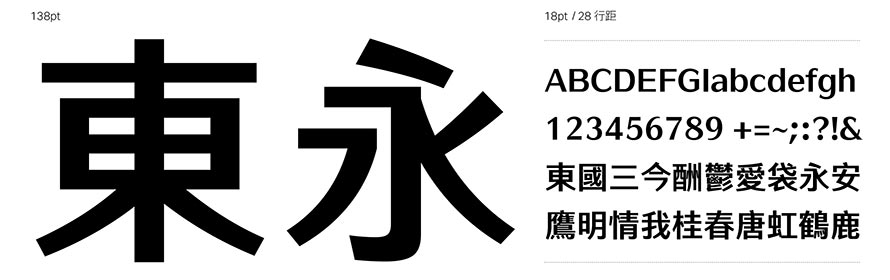
AR FangXinShu keeps the simple and steady of HeiTi, integrates the elegance of MingTi. It makes the most of the legibility of titles and readability of texts to bring the best user experience.
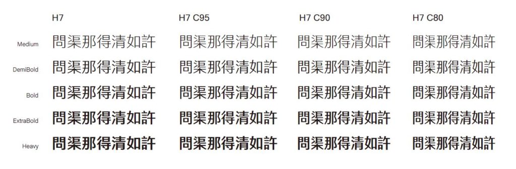
There will be medium to Extra Bold, 10 weights in total, and the horizontal strokes will range from thin to thick each weight. The ratio of vertical and horizontal strokes ranges from 30%~70%, and the width ranges from 80%~95%. The family could be adopted according to different needs.


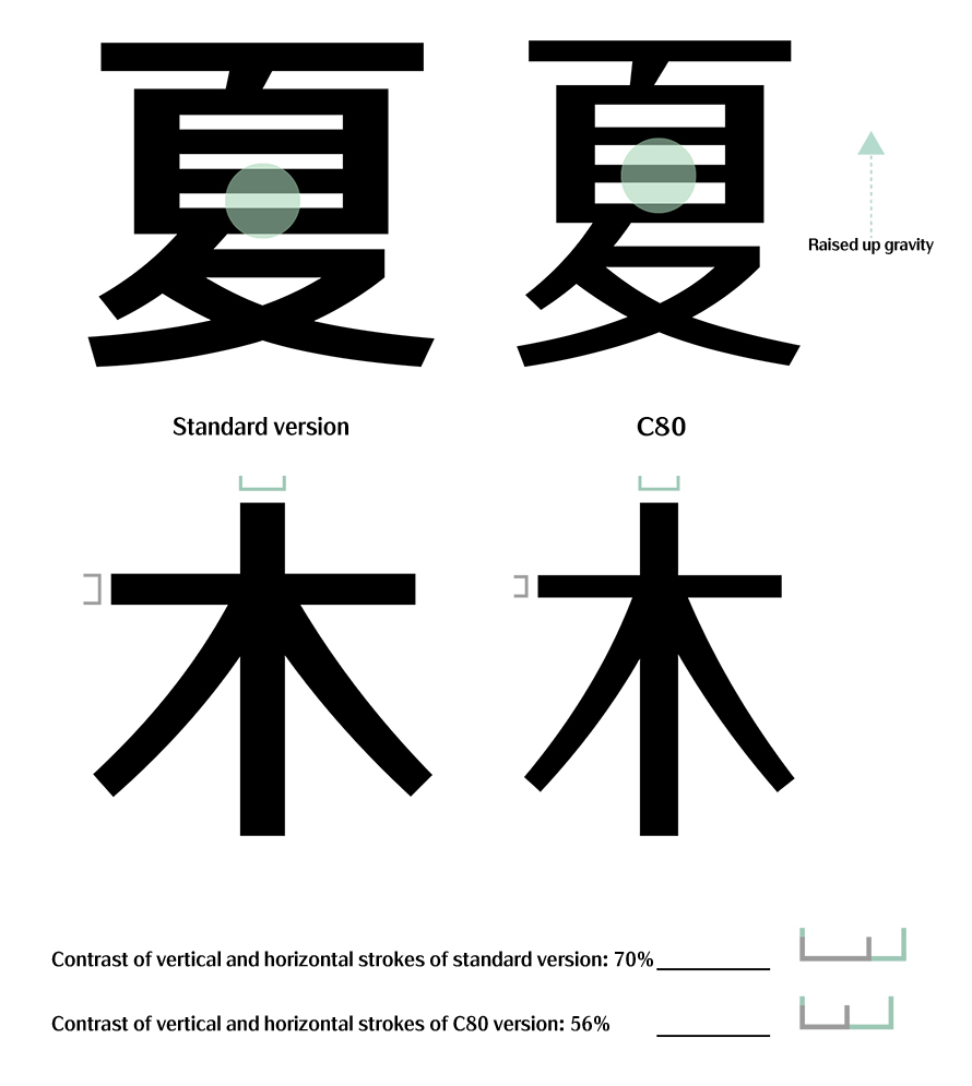
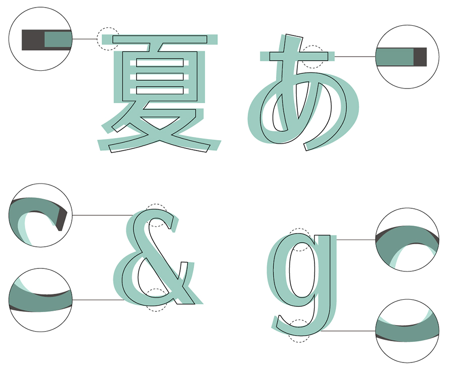
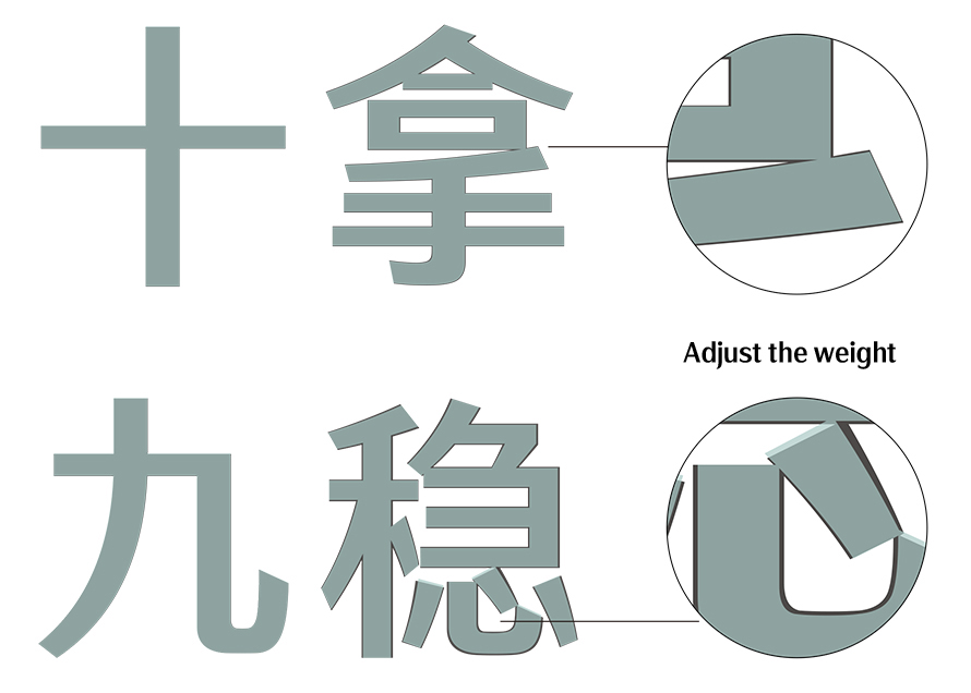
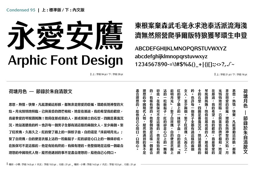
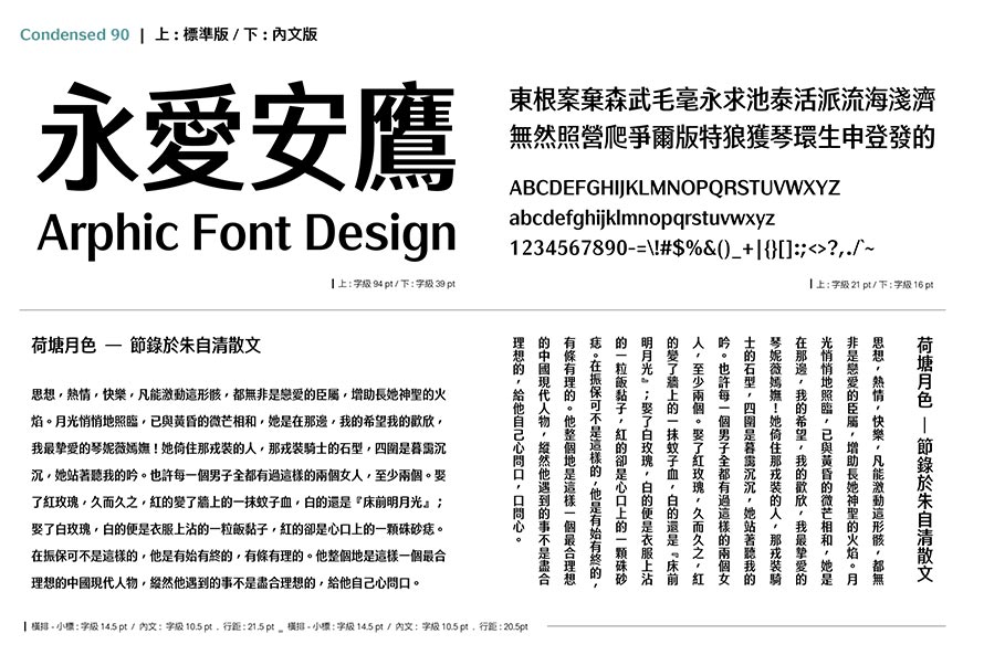
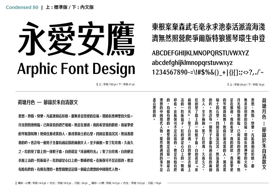
Vertical strokes are thicker than horizontal ones, the use on title and text decides the ratio. Chinese characters starts from 70%, while Latin is adjusted to 56%. Its simplicity raises the legibility.
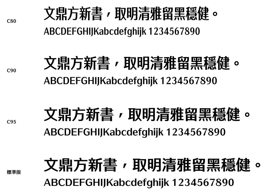

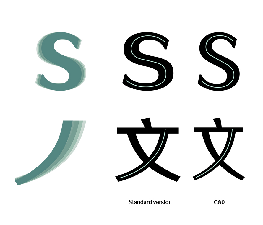
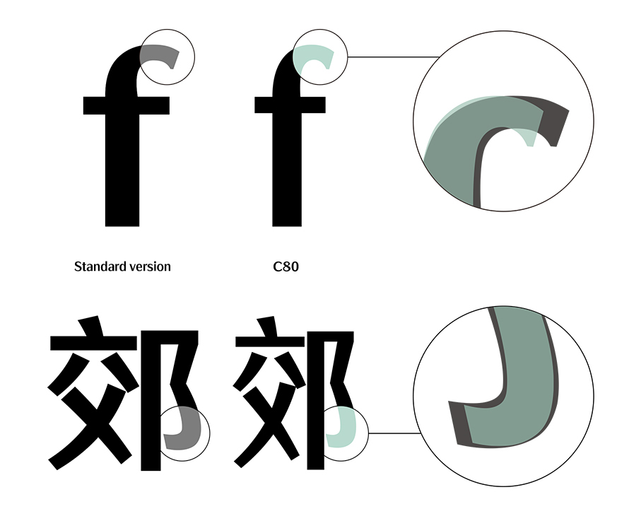
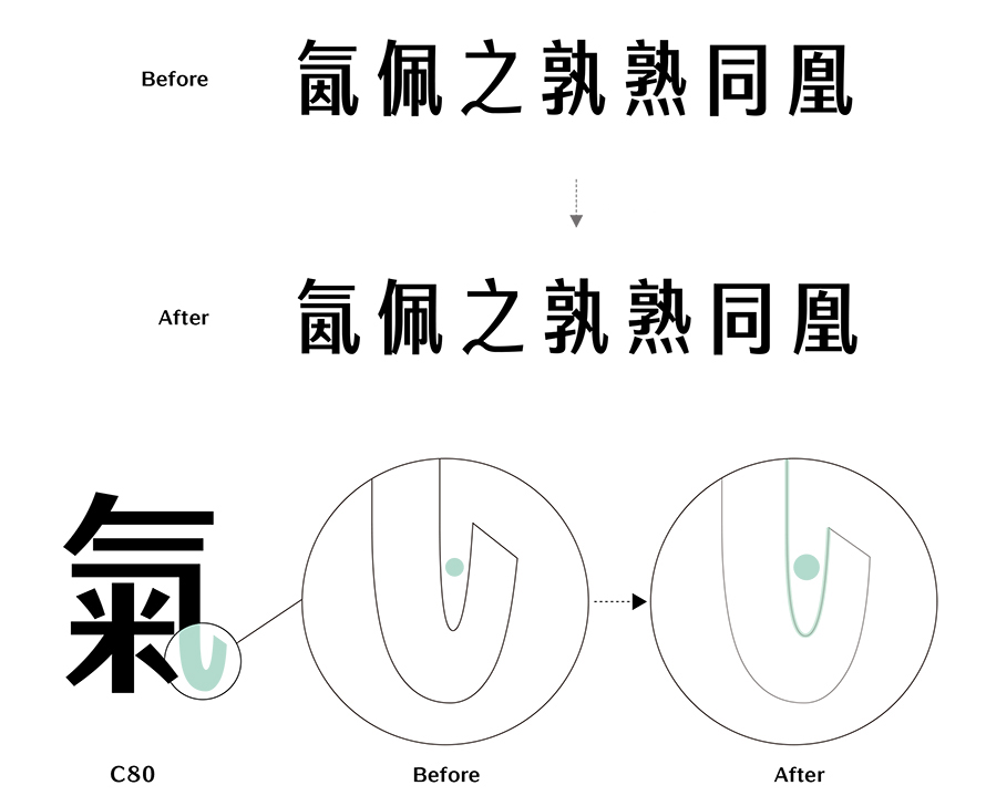
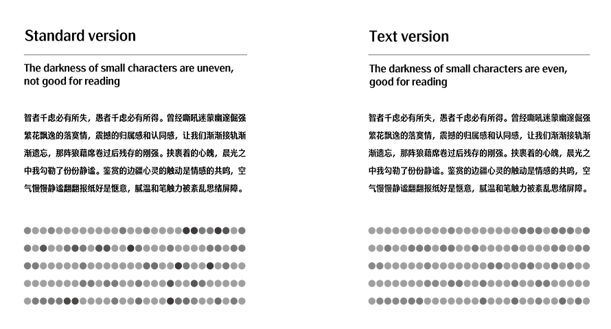
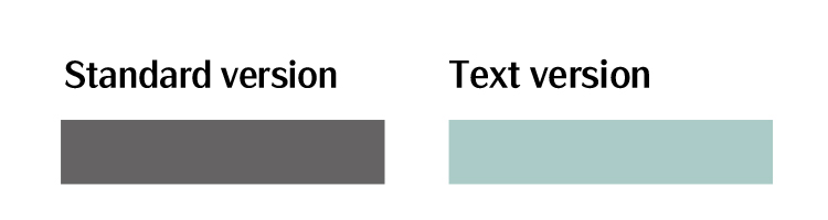
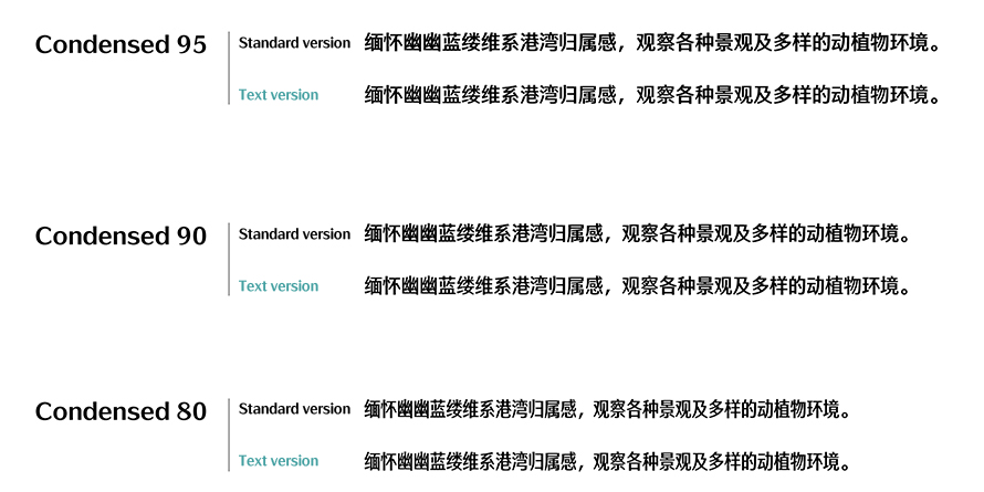
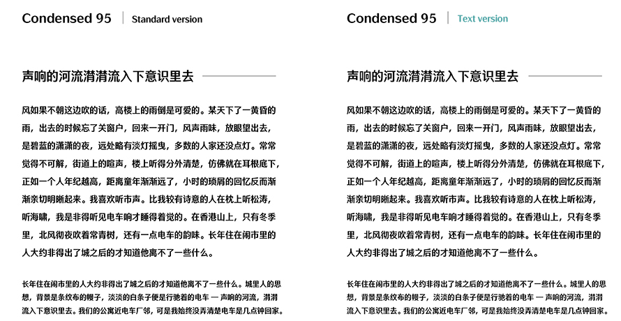
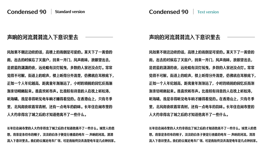
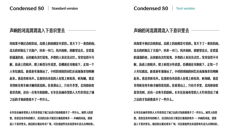
When condensed version was designed, due to the narrowed down space, when the characters are used in small sizes or in the text, it always looks blurry or the darkness uneven. In order to prove it, we adjust the darkness to make reading in small size characters clear and comfortable.
AR FangXinShu is awarded with Granshan 8th International Type Design Competition Chinese Text Typefaces third place

FangXinshu is awarded by 2019 GOLDEN PIN DESIGN AWARD